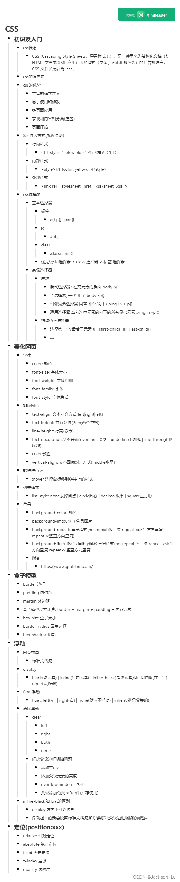
自学CSS总结
1.CSS的导入方式
1.1 行内样式
<!-- 行内样式: 在标签元素中, 编写一个style属性, 编写样式即可 -->
<h1 style="color: blue;">行内样式</h1>
1.2 内部样式
	<!-- 内部样式 -->
	<style>
		h1 {
			color: yellow;
        }
	</style>
1.3 外部样式
	<!-- 外部样式 -->
	<link rel="stylesheet" href="css/sheet1.css">
优先级: 外部样式 < 内部样式 < 行内样式 遵循就近原则.
拓展: 外部样式有两种写法:
- 链接式:
<link rel="stylesheet" href="css/sheet1.css">
- 导入式: CSS2.1 特有的
<style>
    @import url("css/sheet1.css");
</style>
2.选择器
作用: 选择页面的某一个或者某一类元素
2.1 基本选择器
1.标签选择器: 选择一类标签: {}
/** 标签选择器: 会选到页面上所有的这个标签的元素 */
		h1 {
			color: cadetblue;
			background-color: blue;
			border-radius: 24px;/**圆角的边框*/
		}
		p {
			background-color: aquamarine;
		}
- 类选择器class : 选择所有class 属性值一致的标签, 跨标签 .类名{}
作用: 可以多个标签归类是同一个class, 可以复用
		/* 类选择器的样式: .class的名称{}
		 好处: 可以多个标签归类是同一个class, 可以复用*/
		.javaclass{
			color: brown;
		}
		.htmlclass{
			color: cadetblue;
		}
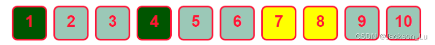
- id选择器: 全局唯一 #id名{}
			/* id选择器: id必须保证全局唯一
			 #id名称{}
			 优先级:
			 不遵循就近原则, 固定的
			 id选择器 > class 选择器 > 标签选择器
			 */
			#divId {
				background-color: #bdff87;
				border-radius: 32px;
			}
优先级 : id选择器 > class 选择器 > 标签 选择器
2.2 层次选择器
- 后代选择器 : 在某元素的后面
/* 后代选择器 */
body p {
	background: blueviolet;
}
	<body>
		<p>p0</p>
		<p class="xinglin">p1</p>
		<p>p2</p>
		<p>p3</p>
- 子选择器, 一代 儿子
/* 子选择器 */
body>p{
    background-color: aqua;
}
- 相邻兄弟选择器 同辈
/* 相邻选择器 兄弟选择器: 相邻(向下) */
.xinglin + p{
    background-color: chartreuse;
}
- 通用选择器 当前选中元素的向下的所有兄弟元素
/* 通用选择器: 当前选中元素的向下的所有兄弟元素 */
.xinglin~p {
    background-color: aqua;
}
2.3 结构伪类选择器
**选择第一个 / 最后子元素 / **
/* ul额第一个子元素 */
ul li:first-child{
    background-color: bisque;
}
/* ul的最后一个子元素 */
ul li:last-child{
    background-color: chartreuse;
}
- 选中p1: 定位到父元素 选择当前的第一个元素 选择当前p元素的父元素 --> 选择当前第一个子元素
/* 选中p1: 定位到父元素 选择当前的第一个元素
选择当前p元素的父元素 --> 选择当前第一个子元素*/
p:nth-child(2){
    background-color: aqua;
}
p:nth-of-type(2){
    background-color: blanchedalmond;
}
		<a href="">asdf asdf </a>
		<h1>h1</h1>
		<p>p0</p>
		<p class="xinglin">p1</p>
		<p>p2</p>
		<p>p3</p>

		<ul>
			<li> li1</li>
			<li> li2</li>
			<li> li3</li>
		</ul>
2.4 属性选择器 (常用)
属性名: 属性名 = 属性值 (正则)
	  =  绝对等于
	  *= 包含这个元素
	  ^= 以这个开头
	  $= 以这个结尾
<!DOCTYPE html>
<html>
	<head>
		<meta charset="utf-8">
		<title>属性选择器</title>
		<style>
		.p-class a {
			float: left;/*让图像项左浮动*/
			display: block;/*block块级元素; none不显示元素*/
			height: 60px;
			width: 60px;
			border-radius: 10px;/*圆角边框*/
			/* border: solid;边框样式 */
			/*边框宽度 | 边框样式(dotted点边框)*/
			border: 3px solid;
			background-color: #77fdff;/*背景颜色*/
			text-align: center;/*文本的对齐方式*/
			color: #ff1437;/*颜色*/
            /*没有文本装饰*/ /*underline red:红色下划线  underline wavy red:红色波浪形下划线*/
			text-decoration: none;
			margin-right: 12px;/*设置元素的右边距:*/
			font: bold 30px/53px arial;/*声明的所有字体属性: 黑体 | 字体大小/*/
		}

		/* 存在id的元素 */
		a[id]{
			background-color: #005500;
		}

		/* id=first的元素 */
		a[id=first]{
			background-color: #ffff00;
		}

		/* class中含有links的元素 */
		a[class*=links]{
			background-color: #9bc8b7;
		}
		/* href中以http开头的元素 */
		a[href^=http]{
			background-color: #005500;
		}

		/* 选中href中以doc结尾的元素 */
		a[href$=doc]{
			background-color: #ffff00;
		}
		</style>
	</head>
	<body>


		<div class="divclass" >
			<p class="p-class">
				<a href="http://www.baidu.com" class="links items first" id="first">1</a>
				<a href="" class="links items active" target="_blank" title="bilibili" id="second">2</a>
				<a href="./id选择器.html" class="links items">3</a>
				<a href="http://www.bilibili.com" class="links items">4</a>
				<a href="./选择器/img/1.jpg" class="links items">5</a>
				<a href="asd" class="links items">6</a>
				<a href="asd.doc" class="links items">7</a>
				<a href="asdf.doc" class="links items">8</a>
				<a href="asd.pdf" class="links items">9</a>
				<a href="/asd.pdf" class="links items last" >10</a>

			</p>
		</div>
	</body>
</html>
效果
3. 美化网页元素
3.1 美化网页的作用
- 有效的传递页面的信息
- 美化网页, 页面漂亮, 才能吸引用户
- 凸显页面的主题
- 提高用户的体验
span标签: 重点要突出的字, 使用span陶起来
<!DOCTYPE html>
<html>
	<head>
		<meta charset="utf-8">
		<title>title</title>
		<style>
			.span1{
				font-size: 50px;
			}
		</style>
	<body>
		welcome to <span class="span1">China</span>
	</body>
</html>
3.2 字体的样式
- font-family: 字体
- font-size: 字体大小
- color: 字体颜色
- font-weight: 字体粗细
<style>
	/* font-family: 字体
			font-size: 字体大小
			font-weight: 字体粗细
			color: 字体颜色
			*/
		body{
			font-family: 楷体;
		}
		h1{
			font-size: 50px;
		}
	</style>
3.3 文本样式
- color: 颜色
- text-align : center; 文本对齐的方式(排版)
- text-indent :2em; 首行缩进(两个空格)
- line-height: 行高(和块的高度一致就可以上下居中)
- text-decoration: underline(下划线)/overline(上划线)/line-through(删除线)/blink(文本闪烁)/none(默认)
- vertical-align:middle 文本图像对齐方式(middle:水平)
<!DOCTYPE html>
<html>
	<head>
		<meta charset="utf-8">
		<title>文本样式</title>

		<style>
			/* 单词
				RGB 红绿蓝 0~F
				RGBA 透明度
				text-align: 排版: 居中|
				text-indent: 首行缩进
				line-height: 行高
			 */
			/* font-family: 字体
				font-size: 字体大小
				font-weight: 字体粗细
				color: 字体颜色
				*/
			body{
				/* text-align: center; */
				font-family: 楷体;
			}
			.p1{
				text-indent: 2em;
				line-height: 50px;
			}
			h1{
				font-size: 50px;
			}
			.a1{
				text-decoration: underline;/*下划线*/
			}
			.a2{
				text-decoration: underline wavy red;/*下划线 波浪线 红色*/
			}
			.a3{
				text-decoration: line-through;/*中划线*/
			}
			.a4{
				text-decoration: overline blue;/*上划线*/
			}
				/* 文本图片对齐 */
			img,span{
				vertical-align: middle;
			}

		</style>
	</head>
	<body>
		<p class="a1">asdf 阿斯蒂芬给</p>
		<p class="a2">asdf 阿斯蒂芬给</p>
		<p class="a3">asdf 阿斯蒂芬给</p>
		<p class="a4">asdf 阿斯蒂芬给</p>
		<a href="https://www.bilibili.com/">啊啊啊啊</a>
		<h1>《梅花易数》</h1>
		<p class="p1">《梅花易数》是中国古代占卜法之一。现在的梅花心易就是梅花易数的别称。相传为宋代易学家邵雍所著,</p>
		<p>梅花易数起源于汉易,是一部以易学中的数学为基础,结合易学中的"象学"进行占卜的书,相传邵雍运用时每卦必中,屡试不爽。</p>
		<p>梅花易数依先天八卦数理,即乾一,兑二,离三,震四,巽五,坎六,艮七,坤八,随时随地皆可起卦,取卦方式多种多样</p>

		<p>
			If you were a teardrop;In my eye,
			For fear of losing you,I would never cry.
			And if the golden sun,Should cease to shine its light,
			Just one smile from you,Would make my whole world bright.
		</p>
		<p>
			<img src="../img/1.png" alt="asd">
			<span>ggg灌灌灌灌灌</span>
		</p>
	</body>
</html>
3.4 文本阴影
- text-shadow: 阴影颜色 水平偏移 垂直偏移 阴影半径
			/* 阴影的颜色|水平偏移| 垂直偏移|阴影的半径*/
			#price{
				text-shadow: #33c858 10px 10px 0px;
			}
3.5 超链接伪类
正常情况下使用a:hover{}
			/* 默认的颜色 */
			a{
				text-decoration: none;
				color: #000;
			}
			/* 鼠标悬停的状态(只要记住:hover) */
			a:hover{
				color: blue;
				font-size: 35px;
			}
3.6 列表
列表样式: list-style:disc(无序列表默认实心圆) / circle(空心圆) / decimal(数字) / square(正方形) / none(去掉圆点)
/* ui li */
/* list-style
	none: 去掉远点
	circle: 空心圆
	decimal: 数字
	square: 正方形
	*/
ul{
	background: #80eecf;
}
ul li{
	height: 30px;
	list-style: none;/*去除圆点*/
	text-indent: 1em;

}
3.7 背景(background)
背景颜色: background-color 背景图片: background-img
ul li{
	height: 30px;
	list-style: none;/*去除圆点*/
	text-indent: 1em;
	background: #b995ff url("../img/right2.png") 215px -9px no-repeat;
}
background: #b995ff url(“…/img/right2.png”) 215px -9px no-repeat;
background: 颜色 路径 x偏移 y偏移 重复样式(no-repeat:仅一次 repeat-x:水平方向重复 repeat-y:竖直方向重复)
3.8 渐变
4.盒子模型
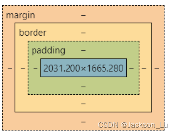
margin:边距
padding:内边距
border:边框
4.1 边框(border)
- 边框的粗细
- 边框的样式
- 边框的颜色
border: 1px solid red
border: 粗细 样式 颜色
4.2 内外边距(margin)
margin: 200px auto;
margin: 上 下 左 右
/* id=box 的样式 */
#box{
		width: 300px;
		border: 1px solid red;
              /* margin: 上 下 左 右; */
		margin: 200px auto;
	}
盒子的计算方式: margin + border + padding + 内容宽度
4.3 圆角边框
border-radius: 20px 30px 40px 50px
border-radius: 左上 右上 右下 左下
		<style>
			div{
				width: 200px;
				height: 200px;
				border: 5px solid red;
				/* border-radius: z左上 右上 右下 左下 */
				/* border-radius: 10px 20px 30px 50px; */
				border-radius: 120px;
				background: red;
				margin: 10px auto;
			}
			img{
				border-radius: 120px;
			}
		</style>
4.4 阴影
box-shadow: 10px 10px 100px yellow;
x 偏移量 | y 偏移量 | 阴影模糊半径 | 阴影颜色
具体的阴影样式
5.浮动
5.1 标准文档流
-
块级元素: 独占一行
h1~h6 p div 列表(ul ol li) -
行内元素: 不独占一行
span a img strong …
行内元素可以包含在块级元素之中, 反之 则不行
5.2 dispaly属性
display: black(块元素) | inline(行内元素) | inline-black(是块元素,但可以内联,在一行) | none(无,隐藏)
这个也是一种实现行内元素的方式,但是很多情况都是用float
/* block    块元素
	inline  行内元素
	inline-block 是快元素,但是可以内联,在一行
	none
*/
div{
    width: 100px;
    height: 50px;
    border: 1px solid red;
    display: none;
}
span{
    width: 100px;
    height: 50px;
    border: 1px solid red;
    display: inline-block;
}
5.3 浮动:float属性
左右浮动 float: left(左) | right(右) | none(默认不浮动) | inherit(继承父类的)
div{
	/* 边框: 上 右 下 左 */
	margin: 10px;
	/* 填充: 上 右 下 左*/
	padding: 5px;
}
#father{

	border: 1px #438d48 solid;
}
.layer01{
	/* solid:实线  dashed:虚线 */
	border: 3px #543d8d dashed;
	/* 设置元素是否被视为块或者内联元素以及用于子元素的布局,例如流式布局、网格布局或弹性布局 */
	/* 形式上,display 属性设置元素的内部和外部的显示类型。 */
	/* 默认值:inline */
	display: inline-block;
	float: right;
}
.layer02{
	border: 3px #798d4f dashed;
	display: inline-block;
	float: right;
}
.layer03{
	border: 3px #86548d dashed;
	display: inline-block;
	float: left;
	/* clear: both; */
}
.layer04{
	/* 设置四个边框样式: 列出的一个,两个或三个值来指定 border 属性,值的顺序无关紧要:*/
	/*  边框宽度 样式 颜色*//* solid:实线  dashed:虚线 */
	border: 2px #c3c617 dashed;
	/* 设置不同的HTML元素的字体大小: 绝对大小值/相对大小值/长度值/百分比/ */
	font-size: 25px;
	/* 设置元素是否被视为块或者内联元素以及用于子元素的布局,例如流式布局、网格布局或弹性布局 */
	/* 形式上,display 属性设置元素的内部和外部的显示类型。 */
	/* 默认值:inline */
	display: inline-block;
	/* 设置行高 */
	line-height: 25px;
	/* 让图像向指定方向浮动 */
	float: left;
	/* 指定段落的左侧或右侧不允许浮动的元素(left/right/both:全部不允许/none:均允许/inherit:规定应该从父元素继承 clear 属性的值) */
	clear: both;
}
5.4 父级边框塌陷问题
当你用到float时就会发现父级边框会塌陷 无法达到效果
解决方法:
- 增加父级元素的高度;(不推荐这种方法)
#father{
	border: 1px #438d48 solid;
	height: 600px;
}
- 增加一个空的div标签, 清楚浮动
<div class="clear" ></div>
.clear{
	clear: both;
	margin: 0px;
	padding: 0px;
}
- 在父级元素中增加一个overflow: hidden;
//在父级元素中增加一个 overflow:hidden
#father{
	border: 1px #438d48 solid;
	/* 指定如果内容溢出一个元素的框,会发生什么 */
	/* scroll/hidden/auto/visible(默认) */
	overflow: hidden;
}
- 父类添加一个伪类(推荐使用)
这种方法虽然有些麻烦,但是没有任何副作用,对文件中的其他元素没有任何影响
#father:after{
	content: '';
	display: block;
	clear: both;
}
小结
-
浮动元素后面增加空div 简单, 代码中尽量避免空div.
-
设置父级元素的高度. 简单, 元素假设有了固定的高度, 就被限制.
-
overflow 简单, 下拉的一些场景避免使用.
-
父类添加一个伪类: after(推荐) 写法稍微复杂些, 但是没有副作用,推荐使用.
5.5 对比
- display 方向不可以控制
- 浮动起来的话会脱离标准文档流,所以要解决父级边框塌陷的问题~
6.定位
6.1 相对定位(position:relative;)
相对于原来的位置,进行指定的偏移, 相对定位的话, 他仍然在标准文档流中, 原来的位置会被保留.
top: -20px;/*上**/
bottom: -50px; 下
right: -30px; 右
left: -10px;左
<!DOCTYPE html>
<html>
	<head>
		<meta charset="utf-8">
		<title>相对定位title</title>
		<!-- 相对定位: 相对于原来的位置进行偏移 -->
		<style>
			div{
				margin: 10px;
				padding: 5px;
				font-size: 12px;
				line-height: 25px;
			}
			#father{
				border: 1px solid #666;
			}
			#first{
				background-color: #5555ff;
				border: 1px dashed #bbb232;
				/* 相对定位: 上下左右 */
				position: relative;
				top: -20px;
				right: -30px;
			}
			#second{
				background-color: #d3ffaf;
				border: 1px dashed #77bbae;
			}
			#third{
				background-color: #ff8fb1;
				border: 1px dashed #989aff;
				position: relative;
				bottom: -50px;
				left: -10px;
			}
		</style>

	</head>
	<body>

		<div id="father">
			<div id="first">第一个盒子</div>
			<div id="second">第二个盒子</div>
			<div id="third">第三个盒子</div>

		</div>
	</body>
</html>
练习: 链接卡
<!DOCTYPE html>
<html>
	<head>
		<meta charset="utf-8">
		<title>练习</title>
		<style>
			#father{
				margin: 0px;
				padding: 10px;
				width: 300px;
				height: 300px;
				border: 2px solid red;
			}
			a{
				width: 100px;
				height: 100px;
				text-decoration: none;
				background-color: #ffc653;
				line-height: 100px;
				text-align: center;
				color: white;
				display: block;
			}
			a:hover{
				background-color: #d7ffb7;
			}
			.a2,.a4{
				position: relative;
				left: 200px;
				top: -100px;
			}
			.a5{
				position: relative;
				left: 100px;
				top: -300px;
				background-color: #61ffe5;
			}
		</style>
	</head>
	<body>
		<div id="father">
			<a href="#" class="a1">链接1</a>
			<a href="#" class="a2">链接2</a>
			<a href="#" class="a3">链接3</a>
			<a href="#" class="a4">链接4</a>
			<a href="#" class="a5">链接5</a>
		</div>
	</body>
</html>
6.2 绝对定位(position:absolute;)
定位: 基于xxx定位, 上下左右
- 没有父级元素情况下, 相对于浏览器定位.
- 假设父级元素存在定位, 我们通常会相对于父级元素进行偏移.
- 在父级元素或者浏览器的位置, 进行指定的偏移, 绝对定位的话, 他不存在标准文档流中, 原来的位置不会被保留
<head>
		<meta charset="utf-8">
		<title>绝对定位</title>

		<style>
			div{
				margin: 10px;
				padding: 5px;
				font-size: 12px;
				line-height: 25px;
			}
			#father{
				border: 1px solid #666;
				position: relative;
			}
			#first{
				background-color: #5555ff;
				border: 1px dashed #bbb232;
			}
			#second{
				background-color: #d3ffaf;
				border: 1px dashed #77bbae;
				position: absolute;
				left: 30px;
			}
			#third{
				background-color: #ff8fb1;
				border: 1px dashed #989aff;
			}
		</style>
	</head>
6.3 固定定位(position: fixed;)
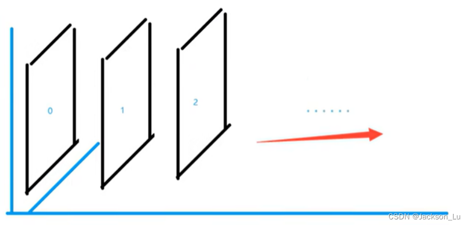
生成绝对定位的元素,相对于浏览器窗口进行定位。 元素的位置通过 “left”, “top”, “right” 以及 “bottom” 属性进行规定
6.4 x-index
设置元素的堆叠顺序。拥有更高堆叠顺序的元素总是会处于堆叠顺序较低的元素的前面。
<!DOCTYPE html>
<html>
	<head>
		<meta charset="utf-8">
		<title>x-index Title</title>
				<!-- <link rel="stylesheet" href="css/style.css"> -->
		<style>
			#box{
				width: 229px;
				margin: 0px;
				padding: 0px;
				overflow: hidden;
				font-size: 12px;
				line-height: 25px;
				border: 1px #000 solid;
			}

			ul,li{
				margin: 0px;
				padding: 0px;
				list-style: none;
			}
			/* 父级元素相对定位 */
			#box ul{
				position: relative;
			}

			.tipText, .tipBg{
				position: absolute;
				width: 229px;
				top: 100px;
			}
			.tipText{
				color: #0000ff;
				z-index: 999;
			}

			.tipBg{
				background: #000;
				opacity: 0.5;
			}
		</style>
	</head>
	<body>
		<div id="box">
			<ul>
				<li><img src="img/22.png" alt=""></li>
				<li class="tipText">学习服务找狂神</li>
				<li class="tipBg"></li>
				<li>时间: 2023-1-16 18:10:32</li>
				<li>地点: 月球</li>
			</ul>
		</div>
	</body>
</html>
7.总结
!
这是我在学习狂神说java中的CSS模块的总结, 希望帮到看到此文章的人!