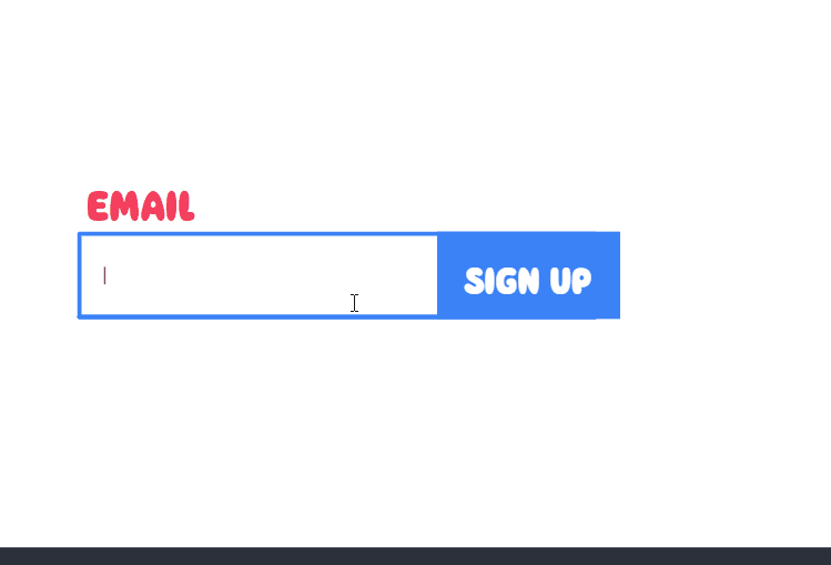
趣味搜索框(Bouncy Castle Form)
更多有趣示例 尽在知屋安砖社区
示例
HTML
<div id="wrap">
<form id="bounce" autocomplete="off">
<input type="email" id="email" maxlength='25' required/>
<input type="submit" id="submit" value="SIGN UP"/>
</form>
<div id="fakeform">
  <p id="wrapper">
    <span class="cursor"></span>
  </p>
</div>
<svg id='bouncehouse' viewbox='0 0 1000 800'>
  <defs>
    <marker id="cap" markerheight="20" markerwidth="20" refx="70" refy="40" orient="auto-start-reverse" viewbox="0 0 800 800">
      <g transform="rotate(90,90,90), translate(0,50)">
      <g>
        <path d="M 60 60 Q 40 70 20 60 Q 10 40 20 20 Q 40 10 60 20 Q 70 40 60 60 "></path>
      </g>
      </g>
    </marker>
  </defs>
  <g transform="translate(100, 0)">
  <path id="base" d="M 90 450 L 710 450 "></path>
  <path id="bottom" d="M 90 450 L 710 450 "></path>
    <path id="top" d="M 400 350 C 280 350 190 350 90 350 L 90 450 L 710 450 L 710 350 C 620 350 530 350 400 350 " marker-end="url(#cap)" marker-start="url(#cap)"></path>
  <path id="slide" d="M 740 400 Q 590 400 520 400 "></path>
  </g>
</svg>
<div class="shark">
  <div class="inner">
  </div>
</div>
</div>
CSS
@font-face{
  font-family: 'Balloon-Base';
  src: url('https://assets.codepen.io/1385231/Balloon+Base.otf')
}

@import url('https://fonts.googleapis.com/css2?family=IBM+Plex+Mono&display=swap');

$r: #F43F5E;
$b: #3B82F6;
$y: #EAB308;

body{
  display:grid;
  place-items:center;
  height:100vh;
  width:100vw;
  overflow:hidden;
  background:#fff;
  *{
    box-sizing:border-box;
  }
  &.sliding{
    #bounce{
      input#submit{
        transition:opacity 0.2s ease-in-out;
        opacity:0;
      }
    }
    #wrap{
      background-position: 50% 600px;
      box-shadow:inset 0 0 0 0 #fff;
      animation:bounce2 0.5s ease-in-out 10 alternate 0.3s;
      @keyframes bounce2{
        to{
          background-size:225px 725px;
        }
      }
      &:before{
        transform:scale(0);
      }
      .shark{
        &:before{
          transform:scaleX(1);
          transition-delay:3.25s;
        }
        .inner{
          transform:translateY(0);
          transition-delay:3.5s;
          &:before, &:after{
            transition-delay:0s;
            height:60px;
            transform:translateY(0px);
            background:#000;
          }
          &:after{
            background:#fff;
          }
        }
      }
    }
    #fakeform{
      &:before{
        transition:clip-path 0.3s ease-in-out;
        transform:translateY(0);
        transition-delay:0.3s;
        opacity:1;
        clip-path: polygon(0 0, 100% 0, 100% 100%, 0% 100%);
      }
      p{
        transform:translateX(35px);
        > span{
          animation-play-state:running;
          &:last-of-type{
            &:after{
              display:none;
            }
          }
          > span{
            animation-play-state:running;
            &:before{
              animation-play-state:running;
            }
          }
        }
      }
    }
    svg{
      transform:translateY(25px);
      marker{
        path{
          fill:$y;
        }
      }
      path{
        &#slide{
          d: path('M 740 620 Q 520 620 520 430 ');
          stroke:#fff;
          transform:translate(50px, -50px);
          transition-delay:0.2s;
        }
        &#bottom{
          stroke:$b;
          stroke-width:120;
          transform:translateY(50px);
          transition-delay:0.2s;
          transition-duration:0.5s;
        }
        &#base{
          stroke:$y;
          stroke-width:140;
          transform:translateY(100px);
          transition-delay:0.3s;
          transition-duration:0.75s;
        }
        &#top, &#mid{
          stroke:$r;
          d: path('M 60 130 C 90 170 90 220 90 270 L 90 470 L 710 470 L 710 270 C 710 220 710 170 740 130  ');
          stroke-width:100;
          animation:waving 0.35s ease-in-out 2.5 alternate forwards 0.3s;
          @keyframes waving{
            to{
              d: path('M 120 120 C 90 170 90 220 90 270 L 90 470 L 710 470 L 710 270 C 710 220 710 170 680 120 ');
            }
          }
        }
      }
    }
  }
  .shark{
    position:absolute;
    width:200px;
    height:200px;
    right:-150px;
    bottom:-350px;
    overflow:hidden;
    z-index:99;
    &:before{
      content:'';
      position:absolute;
      bottom:0;
      left:0;
      height:3px;
      width:100%;
      background:#000;
      transition:0.3s ease-in-out;
      transition-delay:1.5s;
      z-index:9;
      transform:scaleX(0);
    }
    .inner{
      position:absolute;
      width:150px;
      height:100%;
      left:100px;
      top:0;
       background:radial-gradient(ellipse at center, #fff 1px, #000 1px, #000 3px, transparent 5px) 50px 50% / 10px 20px no-repeat, radial-gradient(ellipse at bottom left, #fff 45px, #fff 45px, #efefef 55px, transparent 55px) 0px 100% / 100px 250px no-repeat, radial-gradient(ellipse at bottom left, transparent 45px, #ccc 45px, #ccc 75px, transparent 75px) 0px calc(100% + 2.5px) / 95px 250px no-repeat;
    -webkit-box-reflect:left -2px;
    transition:0.4s ease-in-out;
    transition-delay:1s;
    transform:translateY(100%);
    &:before, &:after{
      content:'';
      position:absolute;
      width:80px;
      border-radius:40px 40px 20px 20px / 50px 50px 20px 20px;
      background:#000;
      box-shadow:0 0 0 3px $r;
      bottom:20px;
      left:-40px;
      transition:0.2s cubic-bezier(0.175, 0.885, 0.32, 1.005);
      height:2px;
      transform:translateY(-35px);
      background:#000;
    }
    &:after{
      clip-path: polygon(1% 33%, 15% 51%, 17% 15%, 31% 46%, 42% 6%, 47% 45%, 60% 8%, 65% 44%, 80% 14%, 81% 47%, 99% 31%, 100% 79%, 88% 75%, 84% 94%, 70% 81%, 66% 94%, 53% 81%, 44% 94%, 34% 79%, 25% 93%, 16% 79%, 8% 91%, 0% 85%, 1% 100%, 99% 100%, 99% 0%, 2% 0%);
    }
    }

  }
  svg{
    position:absolute;
    width:1000px;
    height:800px;
    top:calc(50% - 400px);
    left:calc(50% - 500px);
    transition:0.5s ease-in-out;
    z-index:1;
    marker{
      path{
        stroke-width:0;
      }
    }
    path{
      stroke-width:5;
      fill:transparent;
      stroke:#000;
      stroke-linecap:round;
      stroke-linejoin:round;
      transition:0.6s cubic-bezier(0.175, 0.885, 0.32, 1.075);
      stroke:$b;
      &#slide{
        stroke-width:105;
        stroke-linecap:butt;
      }
    }
  }
  #fakeform{
    height:100%;
    width:100%;
    position:absolute;
    z-index:100;
    top:0;
    font-family: 'IBM Plex Mono', monospace;
    pointer-events:none;
    &:before{
      transform-style:preserve-3d;
      content:'';
      width:calc(100% - 50px);
      left:25px;
      height:250px;
      background:radial-gradient(circle at bottom, transparent 53px, $r 53px, $r 60px, transparent 60px) -376px 100% / 100% 450px, repeating-linear-gradient(45deg, $y 5px, transparent 5px, transparent 25px, $y 25px, $y 30px), repeating-linear-gradient(-45deg, $y 5px, transparent 5px, transparent 25px, $y 25px, $y 30px);
      position:absolute;
      top:-160px;
      z-index:9;
      box-shadow:inset 0 10px 0 0 $r, inset -10px 0 0 $r, inset 10px 0 0 $r;
      border-radius:10px;
      clip-path: polygon(0 100%, 100% 100%, 100% 100%, 0% 100%);
      transition:opacity 0.2s ease-in-out;
      opacity:0;
      transform:translateY(-150px);
      mask:radial-gradient(circle at bottom, transparent 53px, #000 53px) -376px 100% / 100% 450px;
    }
    p{
      height:100%;
      position:absolute;
      top:-415px;
      left:-75px;
      font-size:24px;
      transition:0.2s ease-in-out;
      > span{
        width:15px;
        position:absolute;
        offset-distance:100%;
        offset-path:path('M 690 620 Q 520 620 520 430 L 80 430 ');
        color:transparent;
        animation:slide 2s ease-in 1 forwards;
        animation-play-state:paused;
        transform:scaleY(-1) scaleX(-1);
        --height:1;
        > span{
          animation:bounce calc(0.45s * var(--height)) ease-in-out 6 alternate;
          animation-play-state:paused;
          display:inline-block;
          position:absolute;
          width:15px;
          height:15px;
          left:50%;
          top:50%;
          color:transparent;
          transform:translate(-50%, -50%);
          perspective:500px;
        }
        > span:before{
          content:attr(data-char);
          color:#000;
          position:absolute;
          left:50%;
          top:50%;
          height:100%;
          width:100%;
          display:flex;
          justify-content:center;
          align-items:center;
          transform:translate(-50%, -50%);
          animation:flip calc(0.45s * var(--height)) ease-in-out 5, tumble 0.5s ease-in-out infinite;
          transform:rotate(0deg) translate(-50%, -50%);
          transform-style:preserve-3d;
          @keyframes tumble{
            from{
              transform-origin:-5px 50%;
              transform:rotate(0deg) translate(-50%, -50%);
            }
            to{
              transform-origin:-5px 50%;
              transform:rotate(360deg) translate(-50%, -50%);
            }
          }
          @keyframes flip{
            0%{
              transform:rotateX(0deg) rotate(0deg) translate(-50%, -50%);
            }
            100%{
              transform:rotateX(calc(360deg * var(--flipx))) rotate(calc(360deg * var(--flip))) translate(-50%, -50%);
            }
          }
          animation-play-state:paused;
        }
        &:nth-of-type(2n){
          --height:1.15;
        }
        &:nth-of-type(3n){
          --height:1.25;
        }
        &:nth-of-type(4n){
          --height:0.75;
          --flip:-1;
        }
        &:nth-of-type(even){
          --flip:1;
          --flipx:0;
        }
        --flip:0;
        --flipx:1;
        @for $i from 1 through 50{
          &:nth-of-type(#{$i}){
            offset-distance:calc(100% - #{$i * 15px});
            animation-delay:calc(1s + 1.75s * var(--height) + (#{$i/20}s * var(--height)));
            > span{
              animation-delay:calc(#{$i/20}s * var(--height));
               &:before{
                animation-delay:calc(#{$i/20}s * var(--height)), calc(#{$i/20}s * var(--height) + 3s);
              }
            }

            @keyframes bounce{
              to{
                transform:translateY(calc(-100px * var(--height)));
              }
            }

            @keyframes slide{
              75%{
                offset-distance:0;
                transform:scaleY(-1) scaleX(-1);
              }
              99.5%{
                offset-distance:0;
                transform:scaleY(-1) scaleX(-1) translateY(150px);
                opacity:1;
              }
              100%{
                offset-distance:0;
                opacity:0;
                transform:scaleY(-1) scaleX(-1) translateY(150px);
              }
            }

          }
        }
        &:last-of-type{
          &.cursor{
            &:after{
              right:0;
            }
          }
          &:after{
            content:'|';
            opacity:0;
            position:absolute;
            top:50%;
            transform:translateY(-50%);
            right:-15px;
            color:#000;
            animation:blinking 1s linear infinite;
            @keyframes blinking{
              50%{
                color:#000;
              }
              50.005%{
                color:#fff;
              }
              100%{
                color:#fff;
              }
            }
          }
        }
      }
    }
  }
  #wrap{
    width:600px;
    max-width:100%;
    height:80px;
    position:relative;
    background:radial-gradient(circle at center, #fff 200px, #000 200px, #000 203px, transparent 203px) 50% 400px / 200px 750px repeat;
    box-shadow:0 0 0 10px #fff;
    transform:scale(0.75);
    transition:background-position 0.3s ease-in-out;
    &:before{
      content:'EMAIL';
      font-family:"Balloon-Base";
      top:-75px;
      left:0;
      color:$r;
      font-size:50px;
      position:absolute;
      transition:0.2s ease-in-out;
    }
  }
  form{
    position:absolute;
    width:100%;
    height:100%;
    z-index:999;
    &:hover ~ #fakeform{
      #wrapper{
        > span{
          &:last-of-type{
            &:after{
              opacity:1;
            }
          }
        }
      }
    }
    input{
      outline:none;
      position:absolute;
      height:100%;
    }
    input#email{
      left:0;
      width:75%;
      opacity:0;
    }
    input#submit{
      width:220px;
      right:-40px;
      height:106px;
      top:-13px;
      text-align:center;
      border:none;
      background:transparent;
      font-family:'Balloon-Base';
      color:#fff;
      font-size:44px;
      transition:0.25s ease-in-out;
      cursor:pointer;
      &:hover{
        background:$y;
      }
    }
  }
}
JS
const bounce = document.getElementById("bounce");
const fakeForm = document.getElementById("wrapper");
const email = document.getElementById("email");

bounce.addEventListener('keyup', appendChar);
bounce.addEventListener('submit', submitForm);

function appendChar(){
  let formVal = email.value;
  let result = "";
  let inputData = document.createElement("p");
  inputData.setAttribute("id", "fieldtext");
  inputData.innerHTML = formVal;
  fakeForm.innerHTML = '<span class="cursor"></span>';
  let splitText = inputData.textContent.split("");
  splitText.forEach(function(char){
    result += (char.trim() === "") ? "" : "<span><span data-char='"+char+"'>" + char +"</span></span>"
  });
  fakeForm.innerHTML += result;
}

function submitForm(e){
  e.preventDefault();
  document.body.classList.add("sliding");
  setTimeout(() => {
   fakeForm.innerHTML = '<span class="cursor"></span>';
   document.getElementById("bounce").reset(); document.body.classList.remove("sliding");
  }, 6500);
}