echarts 柱状图,分别给每个柱子设置不同的颜色
效果如图:
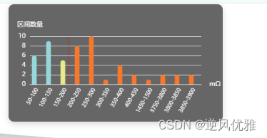
中见竖直的点划线为,markLine ,当markLike超出设定的数值时,颜色变成红色
代码如下:(复制代码,即可查看效果)
数据格式:
var hl_YData =[6,9,5,8,10,1,4,2,1,2,2,2]
var hl_XData = ["50-100","100-150","150-200","200-250","250-300","300-350","350-400","400-450","1450-1500","3750-3800","3800-3850","3850-3900"]
var option = {
            tooltip: {
                trigger: 'item',

            },
            label:{ // 标题的位置
                position:'top',
                show:false
            },

            xAxis: {
                type: 'category',
                data: hl_XData,
                name:'mΩ',
                nameTextStyle:{ // name的样式
                    color:"#fff"
                },
                axisLabel:{
                    interval:0,
                    rotate:60,
                    textStyle: {
                        color: "#fff",
                        fontSize:'10px',
                    },

                },
                axisTick: {
                    show: false
                },
                axisLine: {//x轴线的颜色以及宽度
                    show: true,
                    lineStyle: {
                        color: "#fff",
                        type: "solid",
                        width: 1
                    }
                },
            },
            yAxis: {
                type: "value",
                name: "区间数量",
                nameTextStyle:{ // name的样式
                    color:"#fff"
                },
                axisLabel: { // y轴的文字样式
                    textStyle: {
                        color: "#fff"
                    },
                }
            },
            series: [
                {
                    data: hl_YData,
                    type: 'bar',
                    minBarWidth: hl_XData.length>7?20:35, // 根据数组的长度展示不同的柱子的宽度,当数据太多时,柱子变窄
                    itemStyle: {
                        normal: {
                            color:(val) => {
                                if (val.dataIndex <= hl_XData.indexOf('150-200')) { // 当柱子的数据未超过阈值
                                    var colorList = ['#97D7DB', '#97D7DB', '#EAE88A', '#EAE88A',];
                                    return colorList[val.dataIndex % 4]
                                } else { // 当超过阈值时
                                    return '#F7782C'
                                }
                            },
                            barBorderRadius: [10, 10, 0, 0],
                        },
                    },
                },
                {
                    type: 'bar',
                    markLine: {
                        silent: true, // 鼠标移动到标记线上无操作
                        symbol: "none",
                        itemStyle: {
                            normal: {
                                lineStyle: {
                                    color: '#ff0000',
                                }
                            }
                        },
                        label: {
                                    position: 'end', // 表现内容展示的位置
                                    formatter: '',  // 标线展示的内容
                                    color: '#8C8C8C'  // 展示内容颜色
                                },
                        data: [
                            {
                                xAxis: '150-200'
                            }

                        ]
                    }
                }

            ]
        }