svg动画图形绘制
先介绍下绘制图形的标签
1:线段:line
2:矩形:rect
3: 圆形:circle
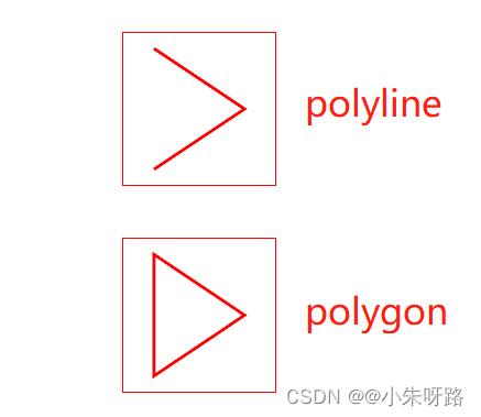
4:多边形:polyline(不会自动连接起点和终点)
5: 多边形:polygon (会自动连接起点和终点)
viewBox 的后2值和svg的宽高设置一致即可 viewBox:‘0 0 width height’
具体原因:看我其他关于他的讲解
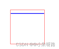
1:线段:line案例
line的属性讲解:
1: x1,y1指的是第一个坐标点
2:x2,y2指的是 第二个坐标点
(二个坐标点连接为一条直线)
3: stroke-width:线段的宽度
4:stroke:线段的颜色
<template>
    <div class="container">
      <svg width="100" height="100" viewBox="0 0 100 100">
        <line
          x1="0"
          y1="10"
          x2="100"
          y2="10"
          stroke-width="2"
          stroke="blue"
        ></line>
      </svg>
    </div>
</template>
<script>
export default {
  name: "SvgAnimation",
};
</script>
<script setup></script>

<style lang="scss" scoped>
.container {
  margin-top: 30px;
  text-align: center;
  svg {
    border: 1px solid red;
  }
}
</style>
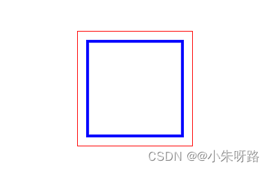
2:矩形:rect
rect的属性讲解:
x指的是x轴的坐标
y是y轴的坐标
stroke-dasharray指的是线段和空白进行绘制成的边框
width指的是矩形的宽
height指的是矩形的高
(有了x,y坐标和宽高就可以组成一个矩形)
stroke:是线段的颜色
stroke-width:线段的宽度
fill:矩形的填充颜色 (置为none是无填充)
<template>
    <div class="container">
      <svg width="120" height="120" viewBox="0 0 120 120">
        <rect
          class="rect"
          x="10"
          y="10"
          width="100"
          height="100"
          stroke="blue"
          fill="none"
          stroke-width="3"
        ></rect>
      </svg>
    </div>
</template>
<script>
export default {
  name: "SvgAnimation",
};
</script>
<script setup></script>

<style lang="scss" scoped>
.container {
  margin-top: 30px;
  text-align: center;
  svg {
    border: 1px solid red;
  }
}
</style>
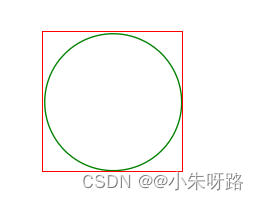
3:圆形 circle
circle属性讲解:
这里是引用
1:cx:距离x轴左侧的距离
2:cy距离y轴顶部的距离
3:r半径
4: stroke-width线段的宽度
5:stroke线段的颜色
6:fill 填充色(none无填充 transparent无填充 red填充色是红色)
<template>
     <div class="container">
      <svg width="101" height="101" viewBox="0 0 101 101">
        <circle
          cx="51"
          cy="51"
          r="50"
          stroke-width="1"
          stroke="green"
          fill="transparent"
        ></circle>
      </svg>
    </div>
</template>
<script>
export default {
  name: "SvgAnimation",
};
</script>
<script setup></script>

<style lang="scss" scoped>
.container {
  margin-top: 30px;
  text-align: center;
  svg {
    border: 1px solid red;
  }
}
</style>
4-5:多边形polygon和polyline
区别:polygon会把起点和终点进行连接在一起
polylinen不会把起点和终点连接在一起
多边形属性讲解
1:points是绘制多个坐标点的
eg: points=“20,10,80,50,20,90”=>=> 形成三个坐标点(20,10),(80,50),(20.90)
2: stroke-width线段的宽度
3:stroke线段的颜色
4:fill图形的填充颜色(fill="none"是无填充色)
<template>
    <div class="container">
      <svg width="100" height="100" viewBox="0 0 100 100">
        <polyline
          points="20,10,80,50,20,90"
          stroke-width="2"
          stroke="red"
          fill="none"
        ></polyline>
      </svg>
    </div>
    <div class="container">
      <svg width="100" height="100" viewBox="0 0 100 100">
        <polygon
          points="20,10,80,50,20,90"
          stroke-width="2"
          stroke="red"
          fill="none"
        ></polygon>
      </svg>
    </div>
 </template>
 <script>
 export default {
   name: "SvgAnimation",
 };
 </script>
 <script setup></script>

 <style lang="scss" scoped>
  .container {
   margin-top: 30px;
   text-align: center;
   svg {
    border: 1px solid red;
  }
}
</style>
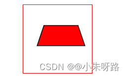
polygon绘制梯形
 <template>
  <div class="container">
    <svg width="100" height="100" viewBox="0 0 100  100">
      <polygon
        points="30 30 80 30 90 60 20 60"
        fill="red"
        stroke="black"
      ></polygon>
    </svg>
  </div>
</template>
<script>
export default {
  name: "SvgAnimation",
};
</script>
<script setup></script>

<style lang="scss" scoped>
.container {
  margin-top: 30px;
  text-align: center;
  svg {
    border: 1px solid red;
  }
}

</style>
更多属性讲解
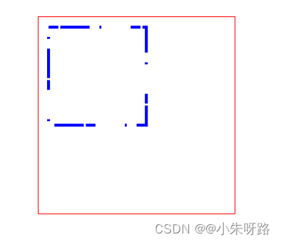
1:stroke-dasharray
stroke-dasharray:10 有一个参数就是 10像素的线段 10像素的空白
stroke-dasharray:10 20 有2个参数就是 10像素的线段 20像素的空白
stroke-dasharray:10 20 30 有3个参数就是 10像素的线段 20像素的空白 30像素的线段 10像素的空白 20像素的线段依次排列
 <template>
  <div>
    <div class="container">
      <svg width="200" height="200" viewBox="0 0 200 200">
        <rect
          class="rect"
          x="10"
          y="10"
          stroke-dasharray="10 2 30"//此属性可以写在标签内也可以写在css样式内
          width="100"
          height="100"
          stroke="blue"
          fill="none"
          stroke-width="3"
        ></rect>
      </svg>
    </div>
  </div>
</template>
<script>
export default {
  name: "SvgAnimation",
};
</script>
<script setup></script>

<style lang="scss" scoped>
.container {
  margin-top: 30px;
  text-align: center;
  svg {
    border: 1px solid red;
  }
}

</style>
2.matrix 复杂变形 对当前的坐标体系进行变换(从原始默认的坐标转换到最新的坐标)
<template>
  <div class="container">
    <svg width="200" height="200" viewBox="0 0 200 200">
      <circle
        cx="100"
        cy="100"
        r="50"
        stroke-width="6"
        stroke="red"
        fill="transparent"
      ></circle>
      <!-- 圆的周长:  2Πr  2*3.1415927*50  加在@keyframes 的stroke-dasharray属性中-->
      <circle
        class="circle-yuan"
        cx="100"
        cy="100"
        r="50"
        stroke-width="6"
        stroke="yellow"
        fill="transparent"
      ></circle>
    </svg>
  </div>
 </<template>>

<script>
export default {
  name: "SvgAnimation",
};
</script>
<script setup></script>

<style lang="scss" scoped>
.container {
  margin-top: 30px;
  text-align: center;
  svg {
    border: 1px solid red;
  }
}
.circle-yuan {
  animation: circle-yuan 5s linear infinite;
}
@keyframes circle-yuan {
 //314是计算的圆的周长
  from {
    stroke-dasharray: 0 314;//开始的时候(from) 0的线段 314的空白
  }
  to {
    stroke-dasharray: 314 0;//结束的时候(to) 314的线段 0的空白--》代表进度条完成一圈
  }
}
</style>
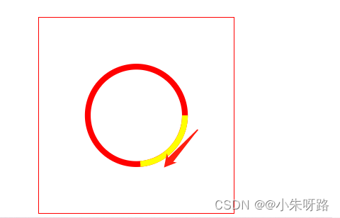
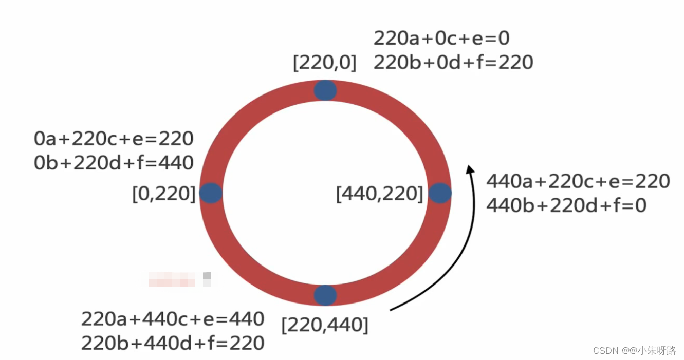
此时我们发现 进度条的起始点是在右侧的中心区域我们想在最上面的中心区域作为起始点需要一个属性 matrix
计算公式:
假如我们的圆圈的坐标点: [0,0] [100,0] [100,50] [0,50]
transform=“matrix(2 1 -1 2 50 0 )” 6个参数 (a d b e c f)
上面的6个参数相当于2个组合:[2,-1,50] ==> 2x+(-1)y+50=x [1,2,0]=>1x+2y+0=y
把每一个数组的值套用上面的公式: x坐标的值用2x+(-1)y+50=x y轴坐标值用[1,2,0]=>1x+2y+0=y
得到的最新的坐标点就是我们需要旋转的点
[50,0] [250,100] [200,200] [0,100] ==>最终的点位进行绘制图形
看下面的图 我们知道了 原始的坐标点 想转移坐标点改变起始位置 对上面的公式进行反推 那么就是得出了matrix的6个值
<template>
  <div class="container">
    <svg width="200" height="200" viewBox="0 0 200 200">
      <circle
        cx="100"
        cy="100"
        r="50"
        stroke-width="6"
        stroke="red"
        fill="transparent"
      ></circle>
      <!-- 圆的周长  2Πr  2*3.1415927*50 -->
      <circle
        class="circle-yuan"
        cx="100"
        cy="100"
        r="50"
        stroke-width="6"
        stroke="yellow"
        fill="transparent"
        transform="matrix(0 -1 1 0 0 200)"
      ></circle>
    </svg>
  </div>
</template>

<script>
export default {
  name: "SvgAnimation",
};
</script>
<script setup></script>

<style lang="scss" scoped>
.container {
  margin-top: 30px;
  text-align: center;
  svg {
    border: 1px solid red;
  }
}
.circle-yuan {
  animation: circle-yuan 5s linear infinite;
}
@keyframes circle-yuan {
  from {
    stroke-dasharray: 0 314;
  }
  to {
    stroke-dasharray: 314 0;
  }
}
</style>
<template>
 <div class="container">

    <svg width="200" height="200" viewBox="0 0 200 200">
      <rect
        x="0"
        y="0"
        width="200"
        height="200"
        stroke="yellow"
        stroke-width="4"
        fill="none"
      ></rect>
      计算出矩形的周长 (长+宽)*2
      <rect
        class="rect-process"
        x="0"
        y="0"
        width="200"
        height="200"
        stroke="red"
        stroke-width="4"
        fill="none"
        transform="matrix(0 1 -1 0 200 0)"
      ></rect>
    </svg>
  </div>
</template>
script>
export default {
  name: "SvgAnimation",
};
</script>
<script setup></script>

<style lang="scss" scoped>
.container {
  margin-top: 30px;
  text-align: center;
  svg {
    border: 1px solid red;
  }
}

.rect-process {
  animation: rect-process 5s linear infinite;
}
@keyframes rect-process {
  from {
    stroke-dasharray: 0 800;
  }
  to {
    stroke-dasharray: 800 0;
  }
}
</style>
矩形进度条
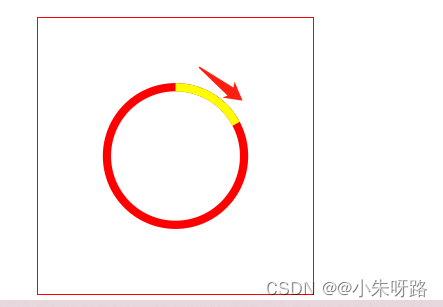
3:stroke-dashoffset: 正数偏移x值的时候,相当于往左移动了x个长度单位,负数偏移x的时候,相当于往右移动了x个长度单位。
 <div class="container">
    <svg class="line-content" width="200" height="200" viewBox="0 0 200 200">
      <line
        class="line"
        x1="0"
        y1="100"
        x2="200"
        y2="100"
        stroke="red"
        stroke-width="2"
      ></line>
    </svg>
  </div>
</template>

<script>
export default {
  name: "SvgAnimation",
};
</script>
<script setup></script>

<style lang="scss" scoped>
.container {
  margin-top: 30px;
  text-align: center;
  svg {
    border: 1px solid red;
  }
}
.line {
//默认的时候是200的线段和200的空白
  stroke-dasharray: 200;
  //往左位移了200像素 只剩200的空白了
  stroke-dashoffset: 200;
 // transition:为属性定义过度(width  height等等)  :name  过度时间  速度 延迟时间
  transition: stroke-dashoffset 0.5s ease-out;
}
.line-content {
  //鼠标悬入的时候把位移置为0(默认值) 就是又出现默认的情况只剩200的线段和200的空白
  &:hover {
    .line {
      stroke-dashoffset: 0;
    }
  }
}
</style>
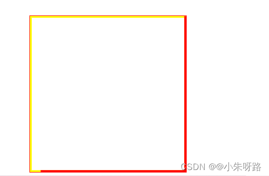
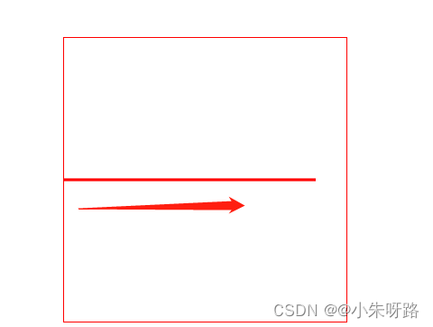
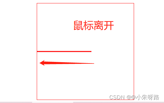
初始状态和结束状态
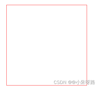
鼠标悬入
鼠标离开
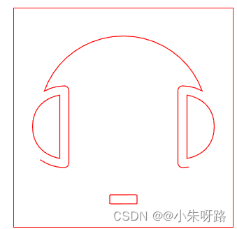
4.getTotalLength()方法是获取图形的长度的
<template>
  <div class="container">
    <svg class="icon" viewBox="0 0 1024 1024" width="200" height="200">
      <path
        class="logo"
        d="M448 917.376C448 917.333333 576 917.333333 576 917.333333c0.085333 0 0-42.709333 0-42.709333C576 874.666667 448 874.666667 448 874.666667c-0.085333 0 0 42.709333 0 42.709333z m371.349333-173.034667C809.6 745.877333 799.573333 746.666667 789.333333 746.666667a21.333333 21.333333 0 0 1-21.333333-21.333334V384a21.333333 21.333333 0 0 1 21.333333-21.333333 191.146667 191.146667 0 0 1 92.373334 23.637333C828.202667 234.517333 681.045333 128 511.296 128 341.290667 128 193.749333 234.816 140.458667 387.328A191.125333 191.125333 0 0 1 234.666667 362.666667a21.333333 21.333333 0 0 1 21.333333 21.333333v341.333333a21.333333 21.333333 0 0 1-21.333333 21.333334 192 192 0 0 1-148.906667-313.216 21.269333 21.269333 0 0 1 0.042667-8.682667C127.36 228.288 304.469333 85.333333 511.274667 85.333333c209.706667 0 388.544 146.944 427.008 347.093334l0.213333 1.344A191.210667 191.210667 0 0 1 981.333333 554.666667c0 70.4-37.909333 131.968-94.421333 165.397333-57.642667 100.693333-154.752 174.762667-268.778667 204.074667A42.517333 42.517333 0 0 1 576 960h-128c-23.573333 0-42.666667-19.157333-42.666667-42.624v-42.752c0-23.552 18.922667-42.624 42.666667-42.624h128c23.573333 0 42.666667 19.157333 42.666667 42.624v5.141333a392.810667 392.810667 0 0 0 200.682666-135.424zM85.333333 554.666667c0.298667 133.589333 128 148.949333 128 148.949333V406.144s-128.298667 14.933333-128 148.522667z m853.333334 0c0.298667-133.589333-128-148.522667-128-148.522667v297.472s127.701333-15.36 128-148.949333z"
        p-id="3965"
      ></path>
    </svg>
  </div>
</template>

<script>
export default {
  name: "SvgAnimation",
};
</script>
<script setup>
import { onMounted } from "vue";
onMounted(() => {
  const logo = document.getElementsByClassName("logo")[0];
  console.log(logo.getTotalLength());// 6919.53759765625
});
</script>
<style lang="scss" scoped>

.logo {
  stroke: red;
  stroke-width: 4;
  animation: logo 5s linear 1 forwards;
}
@keyframes logo {
  0% {
    fill: white;
    stroke: red;
    stroke-dasharray: 6919.53759765625;
    stroke-dashoffset: 6919.53759765625;
  }
  50% {
    fill: white;
    stroke: red;
    stroke-dasharray: 6919.53759765625;
    stroke-dashoffset: 0;
  }
  75% {
    fill: red;
    stroke: white;
  }
  100% {
    fill: blue;
    stroke: white;
  }
}
</style>
效果:
先进行描边
在填充颜色
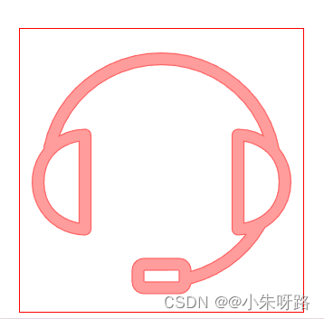
最后定格填充颜色