vue3+ts封装el-select el-input通用组件
你还在为项目中多个页面输入框下拉框样式不统一而苦恼吗,你还在为页面中书写大段重复代码而痛苦吗?那就使用这个组件吧!此组件将输入框和下拉框统一封装,一行代码到处复用!
最近为了统一项目样式,决定将列表头部的输入框和下拉框统一封装,这样无论是哪个页面的输入下拉都看起来一样啦,代码如下:
<template>
  <div class="component_wapper">
    <el-row :gutter="16">
      <el-col v-for="(item, index) in props.searchFormDesc" :key="index" :span="item.layout || 6">
        <slot :name="`search-${item.searchKey}`" :form-data="searchFormData">
          <component
            :is="item.searchType === 1 ? ElInput : ElSelect"
            v-model="searchFormData[item.searchKey]"
            :placeholder="item.placeholder"
            clearable
            :disabled="item.disabled"
            :prefix-icon="item.searchType === 1 ? Search : ''"
            @change="formDataChange"
          >
            <template v-if="item.searchType === 2 && item.option" #default>
              <el-option
                v-for="op in item.option"
                :key="op[item.optionLabel || 'label']"
                :value="op[item.optionValue || 'value']"
                :label="op[item.optionLabel || 'label']"
              />
            </template>
          </component>
        </slot>
      </el-col>
    </el-row>
  </div>
</template>
<script lang="ts" setup>
  import { ref } from 'vue';

  import { Search } from '@element-plus/icons-vue';

  import { searchFormDescType } from './index';
  import { ElInput, ElSelect } from 'element-plus';
  const props = defineProps<{
    searchFormDesc: Array<searchFormDescType>;
  }>();
  const emits = defineEmits(['submit']);
  //搜索词表单
  const searchFormData = ref({});
  const formDataChange = () => {
    emits('submit', searchFormData.value);
  };
</script>
<style scoped lang="scss">
  .component_wapper {
    width: 100%;
    :deep(.el-row) {
      width: 100%;
    }
  }
</style>
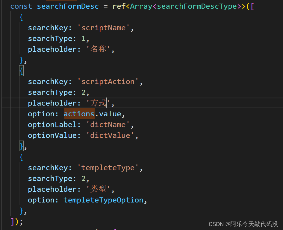
ts如下:
export interface searchFormDescType {
  searchKey: string; //搜索关键字
  searchType: number; //类型:1输入框,2下拉框
  placeholder?: string;
  option?: Array<{
      //下拉框通常默认接收为label,value,但是又特殊情况,在此自行传入
    [key: string]: string | number | boolean;
  }>;
  //组件占比
  layout?: string;
  disabled?: boolean;
 // 自定义下拉框label
  optionLabel?: string;
  // 自定义下拉框value
  optionValue?: string;
}
使用方式

注释:
vue3中使用component标签不能直接使用 is=“el-input”,要先引入element-plus中的组件,然后通过判断进行使用 :is=“item.searchType === 1 ? ElInput : ElSelect”
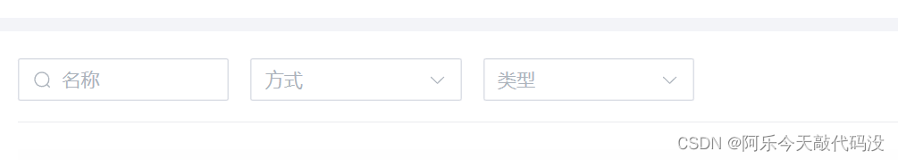
结果: